The design and layout of a hospital website is critical to converting the casual Internet browser into a future patient. A website that is filled with chunks of text, is difficult to navigate, and contains extremely technical terminology could send any Internet browser running to a competitor, which results in lower website conversion rates and lost revenue for your hospital.
Before you build a website and launch it to the public, it is important to make sure it is created in a way that will encourage website traffic to pick your hospital and schedule an appointment. Below, I’ll discuss 4 important elements that every hospital should consider during the website design process. These elements are known to encourage website traffic to take action and schedule appointments with the specialists at your hospital.
Video Increases Conversion Rates
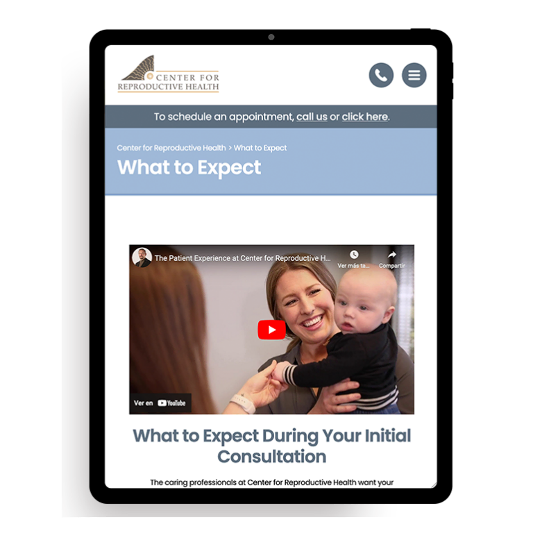
Placing a single video on a website could increase the conversion rate of your website by as much as 15-25%. The video doesn’t have to be complex or appear like a Hollywood production. It just has to be relevant to the services provided by the hospital, high quality, and personable.
Some examples of videos that may help increase the conversion rate of a hospital website include:
- Tours of the facility
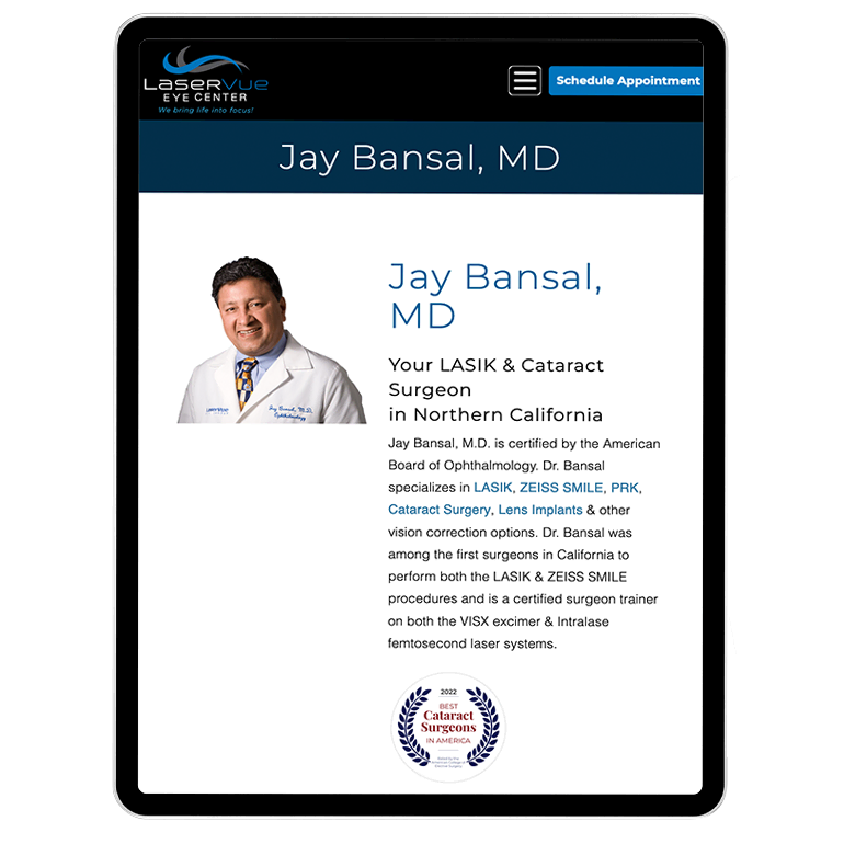
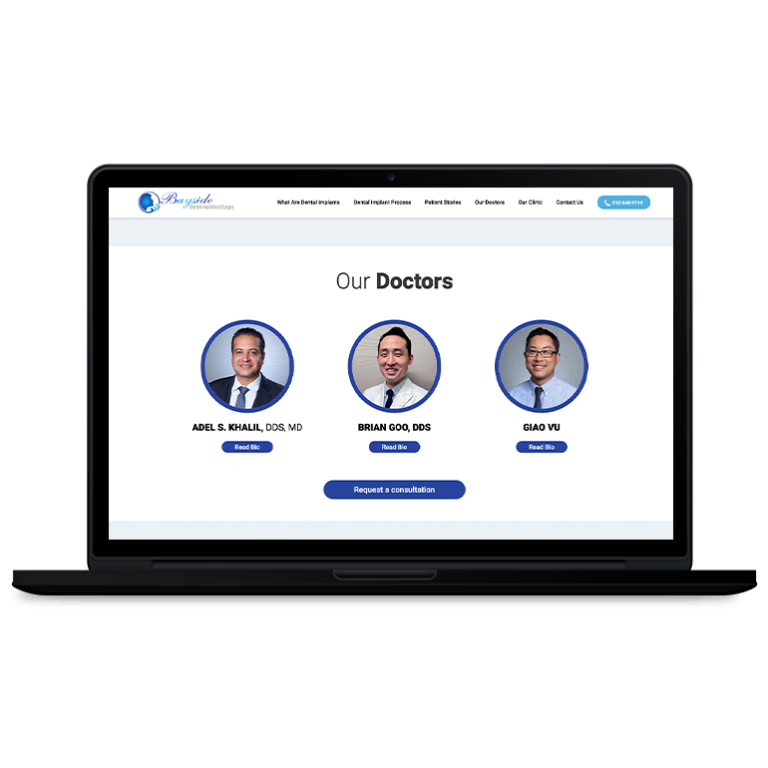
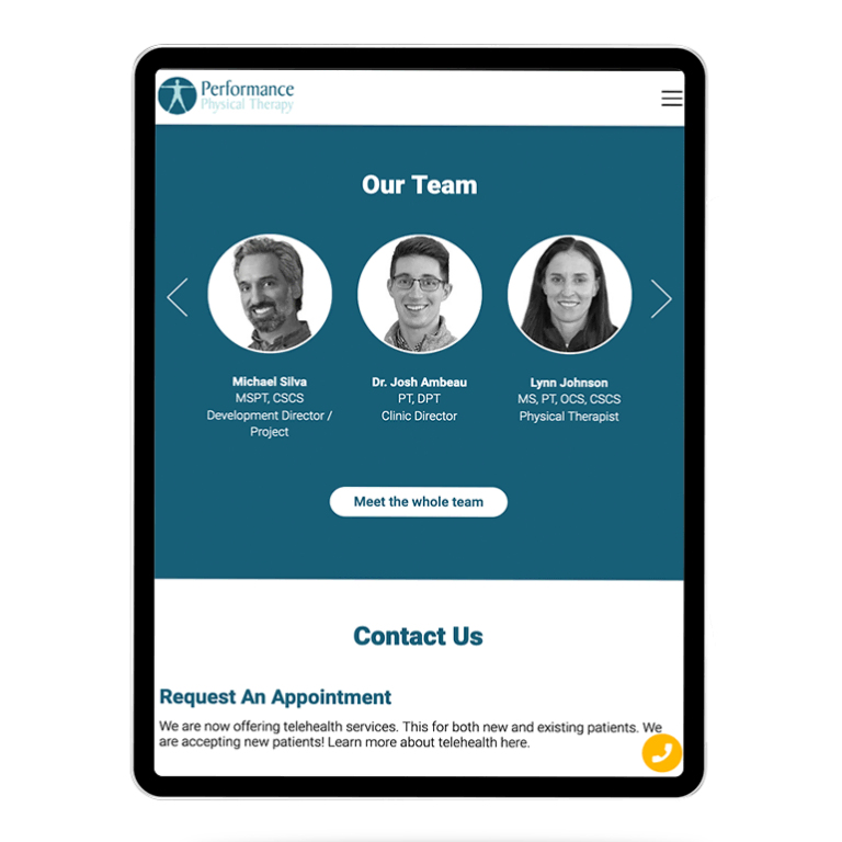
- Profiles of specialists or doctors that practice at the hospital
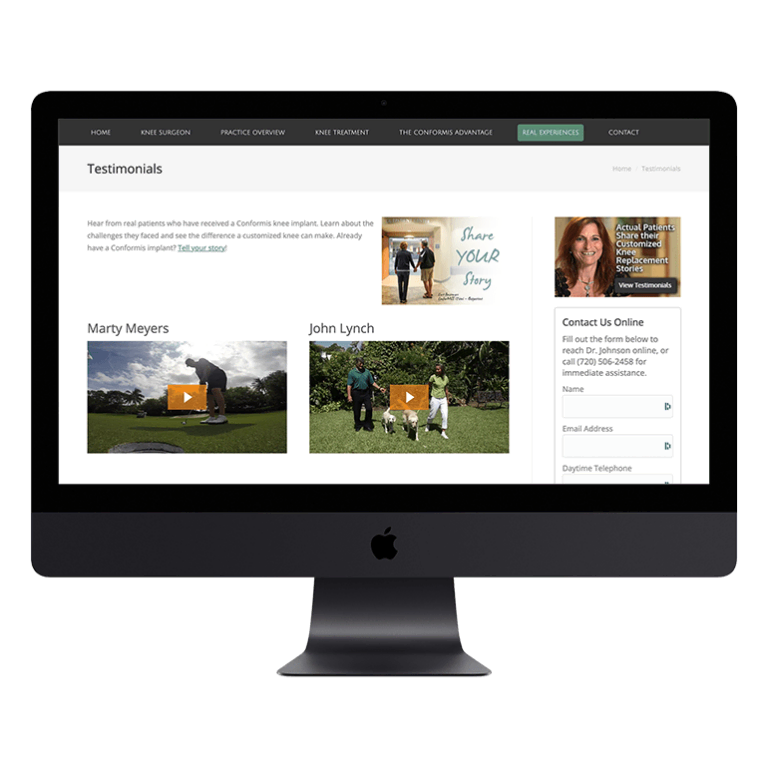
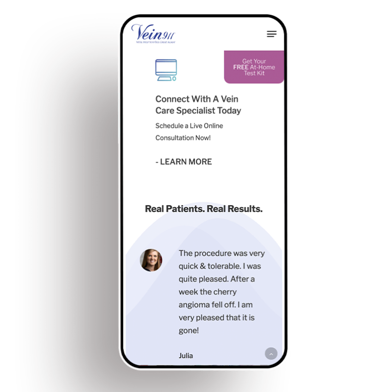
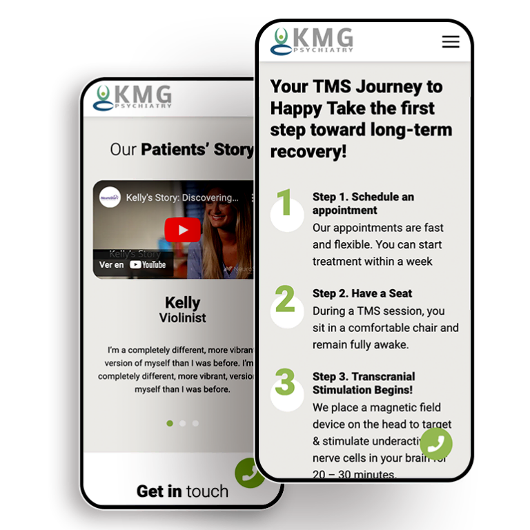
- Patient testimonials
Providing Relevant Content and Information
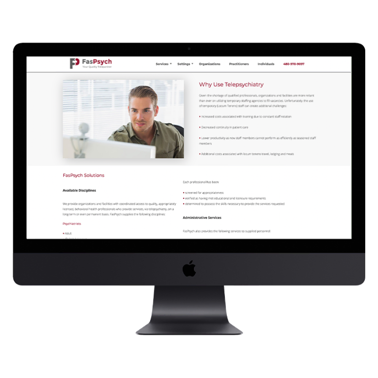
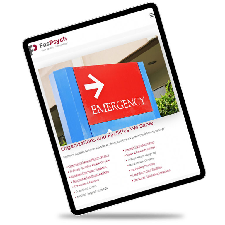
It may be tempting to want to post all about how your current hospital performs the latest rare surgery for kidney patients, but if only a small portion of the country’s population even needs that surgery, it won’t help with prospective patients. Hospital websites need to focus on providing relevant, accurate information that their patients want to read.
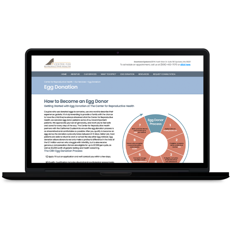
When providing that relevant content, it is important that a hospital consider where it is being placed. For example, a hospital that specializes in kidney transplant surgery may want to talk about it, but placing whole chunks of text on the homepage might drive potential patients away. Creating a separate section or website for this type of surgery or specialist might be more appropriate.
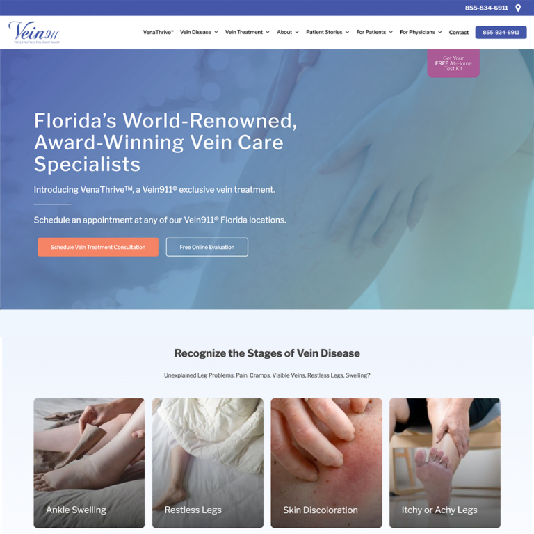
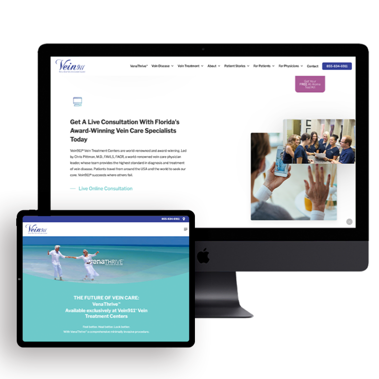
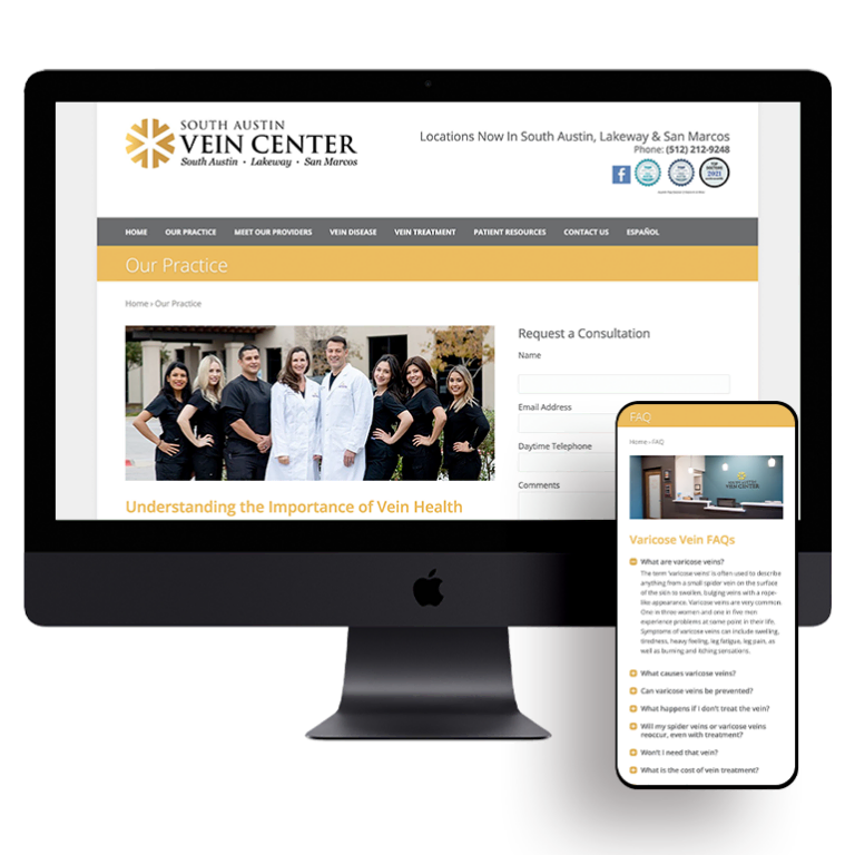
Make the Website Easy to Navigate
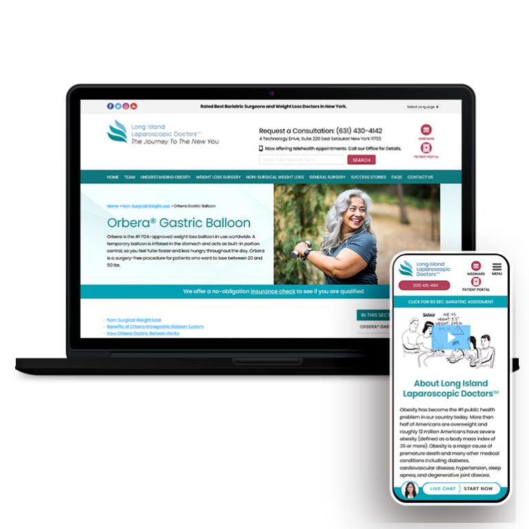
Neilson Research suggests that a person visits a website for approximately 10 seconds before they make a decision about staying on the site. That isn’t a lot of time to make a good first impression. If you wish to keep patients on your hospital website, it is important to make sure it is easy to navigate. If users are confused, they will click out of the site and go elsewhere.
Some ways to make a website easy to use include:
- Easy to read headings
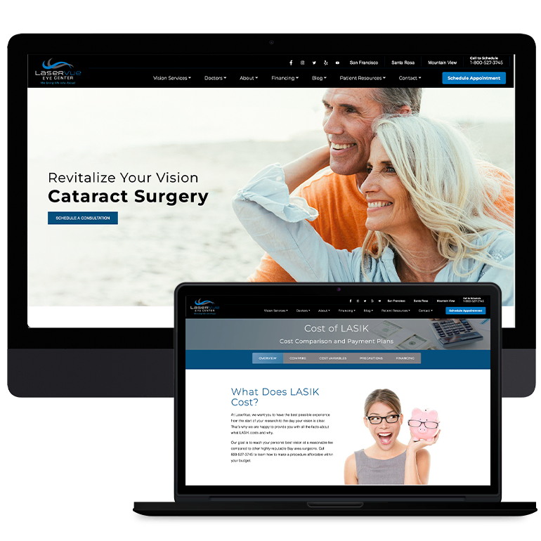
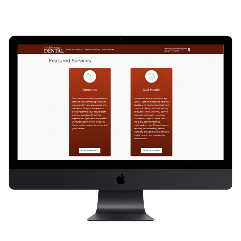
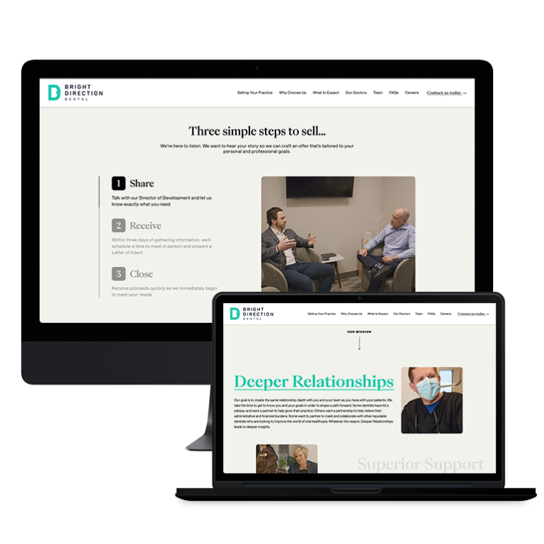
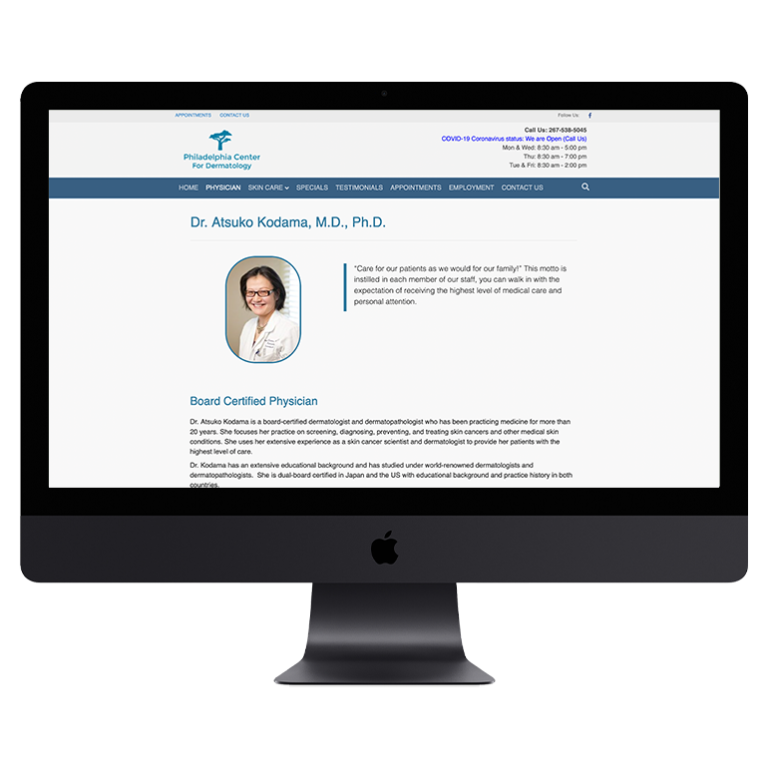
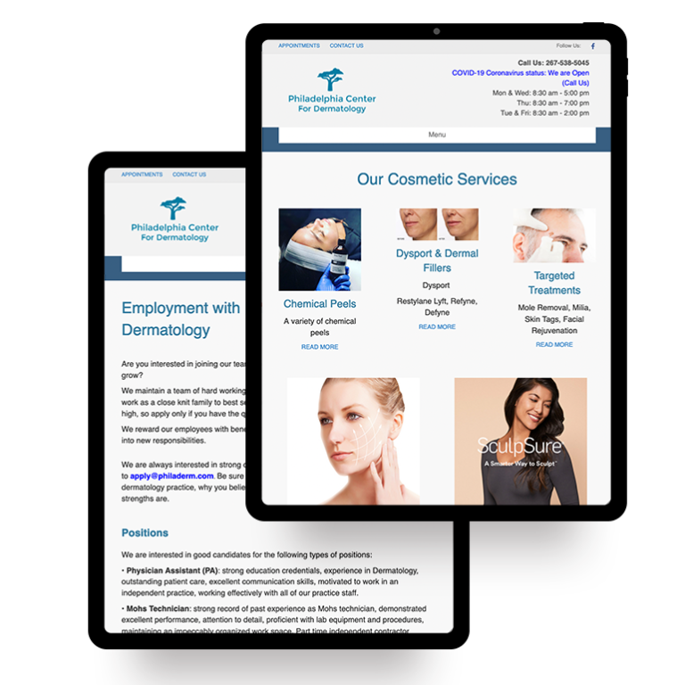
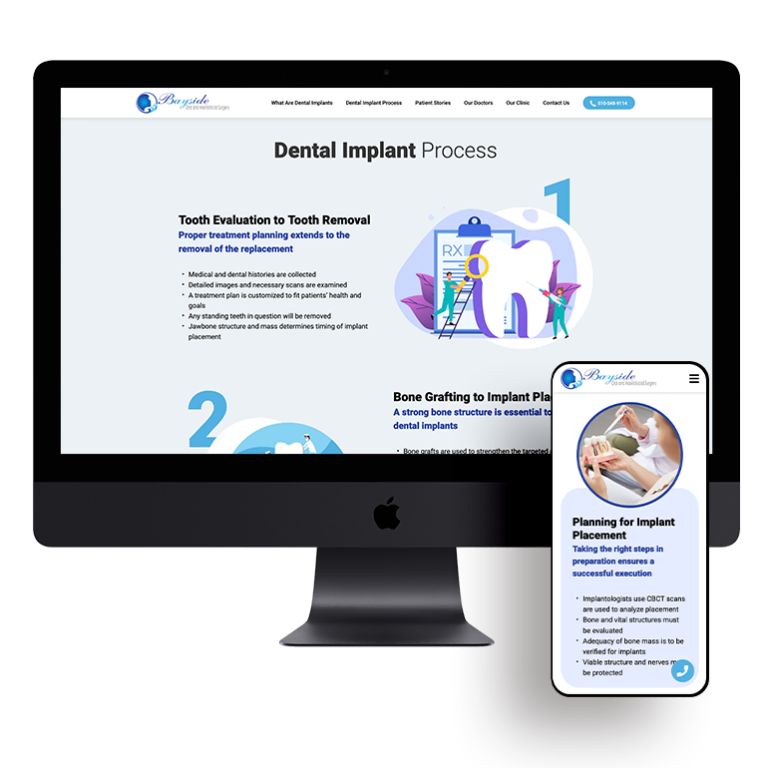
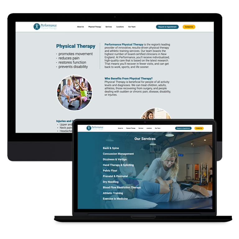
- Easy to navigate design that includes clear sections for all links and services
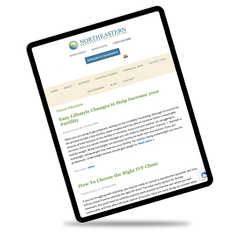
- Easy to read content
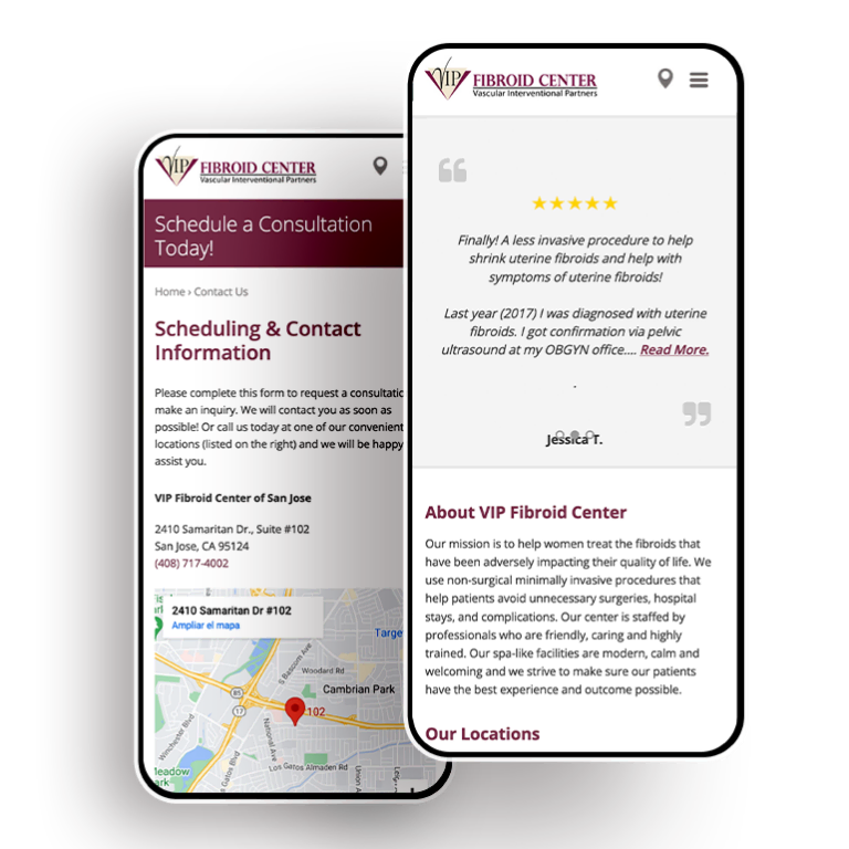
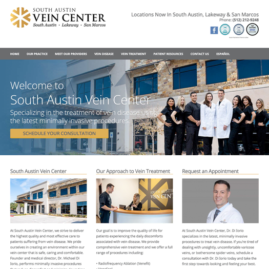
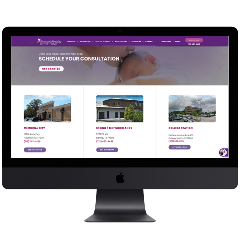
Place Call to Actions on the Website
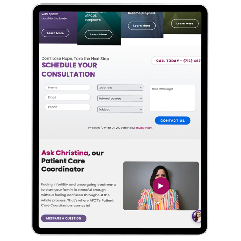
The last thing you want is to have a website user interested in seeking services at your hospital, but they choose to go elsewhere because they do not know what to do to with the information they obtained on your website. That is why it is important to tell them what to do by placing call to actions on the website.
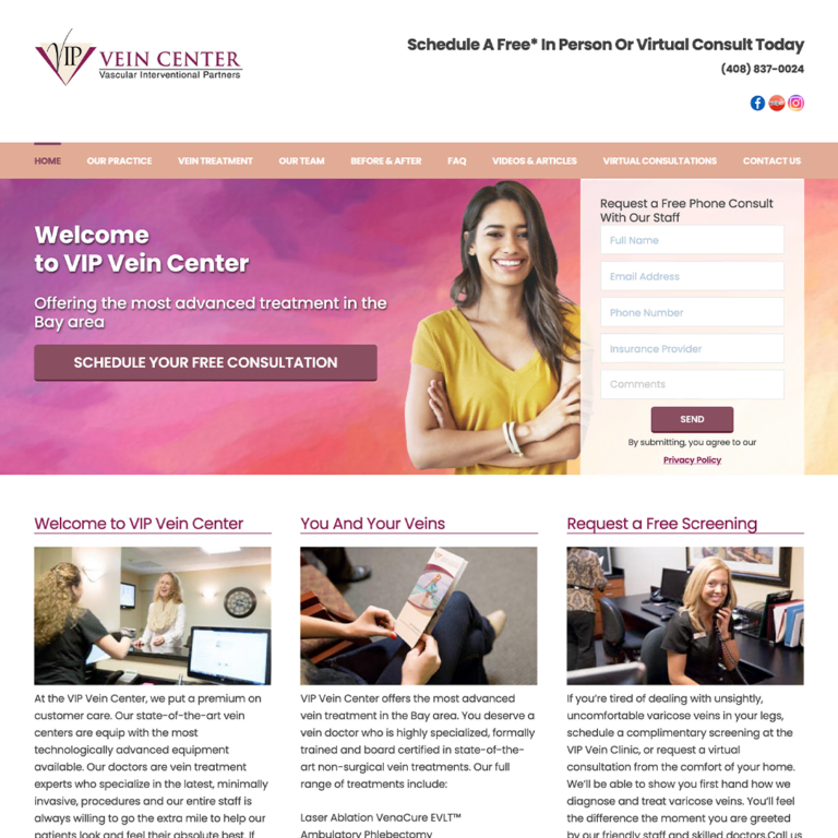
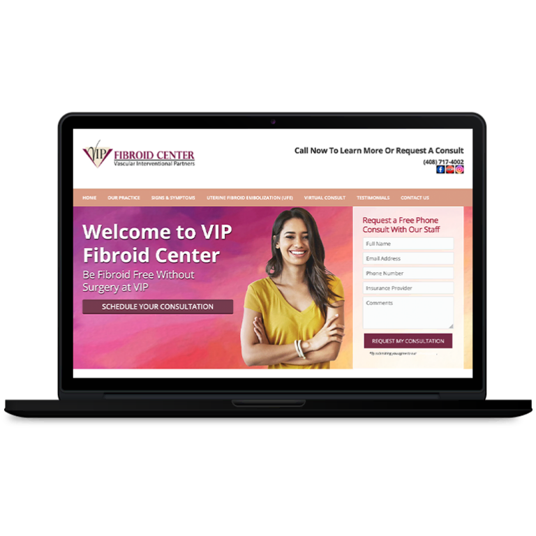
A call to action encourages the website user to follow certain steps to obtain more information from your hospital. Some examples of call to actions that can be found on hospital websites include:
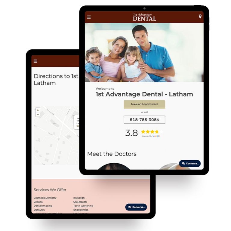
- Call us right now to schedule an appointment
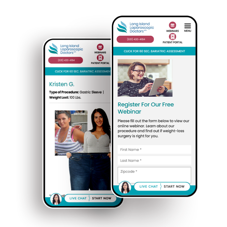
- Fill out our prospective patient form to receive a call from our staff for an upcoming appointment
- Visit our awards page to learn more about what services we have won
There are hundreds, if not thousands, of individuals out there just waiting to become prospective patients of your hospital. All you have to do is build a website that will attract them to your hospital. Making sure a website incorporates these things will help increase your conversions and start attracting new patients to your hospital.









 Smart Design Creates New Patient Opportunities