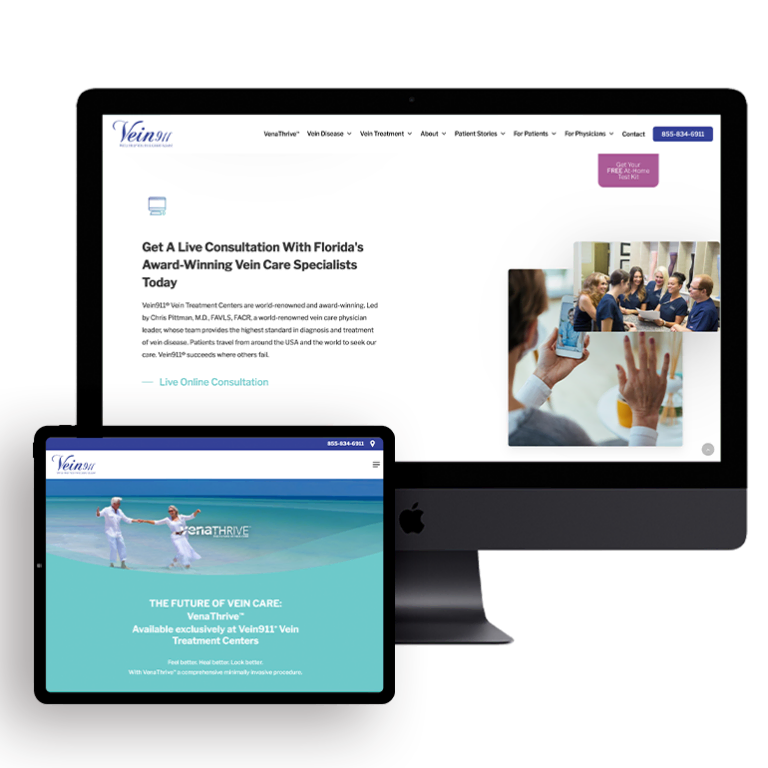
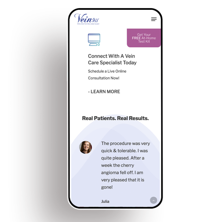
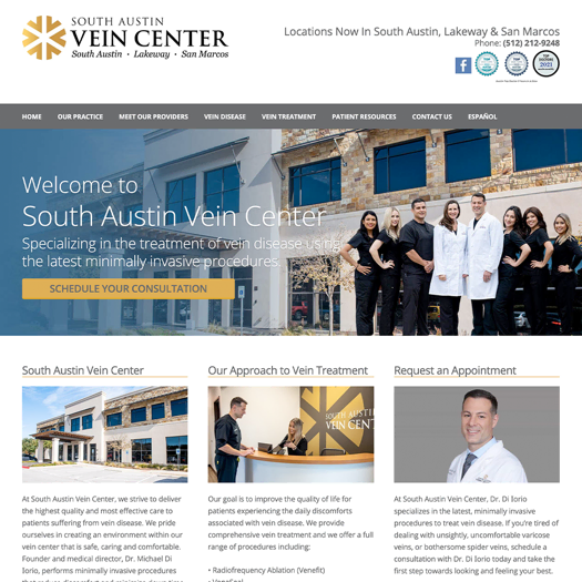
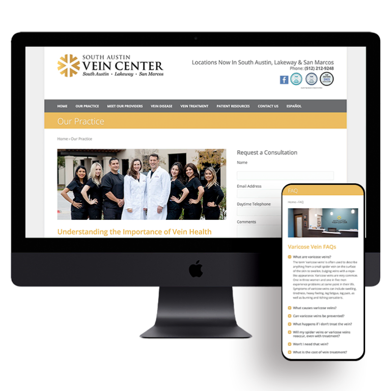
Your hospital’s ability to attract new patients online is largely dependent on the quality of its website.
For hospitals looking to attract new patients online, website optimization should be a top priority. Recent polls suggest that today’s healthcare consumers actually value ease-of-use over trust when comparing various providers online.
If your website is loaded with lengthy blocks of text, employs hard-to-understand language, and is difficult to navigate, chances are your visitors are going to hitting the “back” button and hightailing it to one of your competitors. Of course, this results in a lowered rate of conversion, a negative impact on your ROI, and lost revenue opportunities.
If your hospital is considering building a new website or re-optimizing its existing one, these four tips will help you encourage visitors to take action and book new appointments.
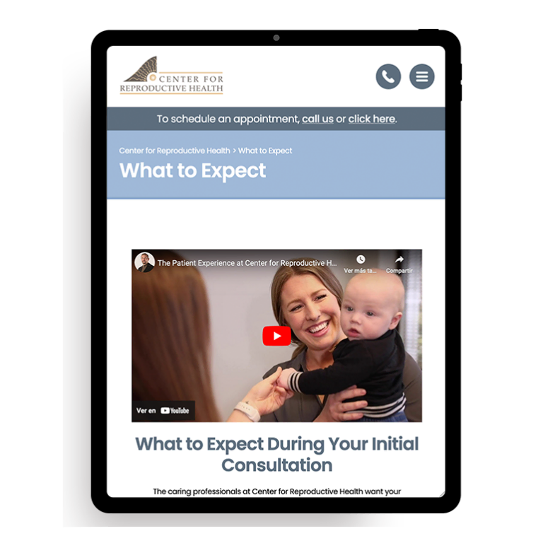
Video Content Helps Increase Conversion Rates
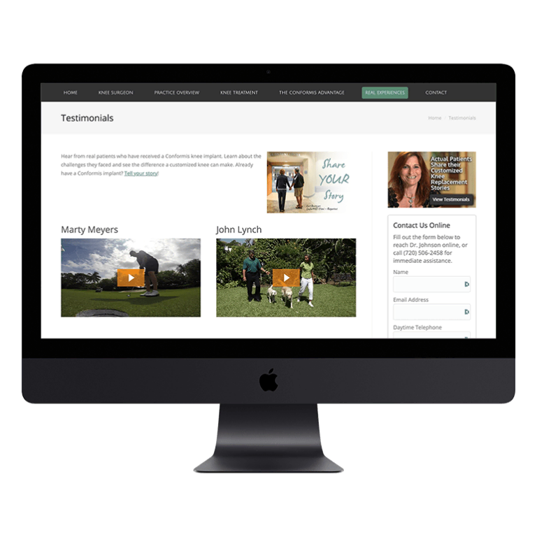
Featuring video content on your website can have a major impact on performance — in fact, according to a recent Forbes article, including a video on a landing page can increase its conversion rate by as much as 80%. This makes a lot of sense when you consider that 90% of consumers say that product videos help them make purchasing decisions, and 64% are actually “more likely” to purchase a product or service after watching a video about it.
Types of videos that prospective patients may find useful include:
- Facility tours
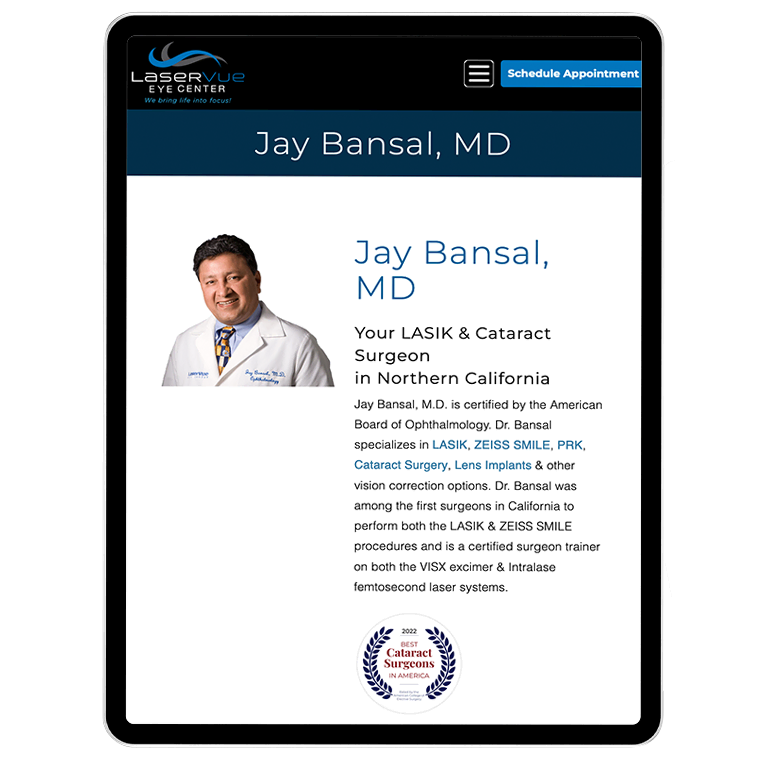
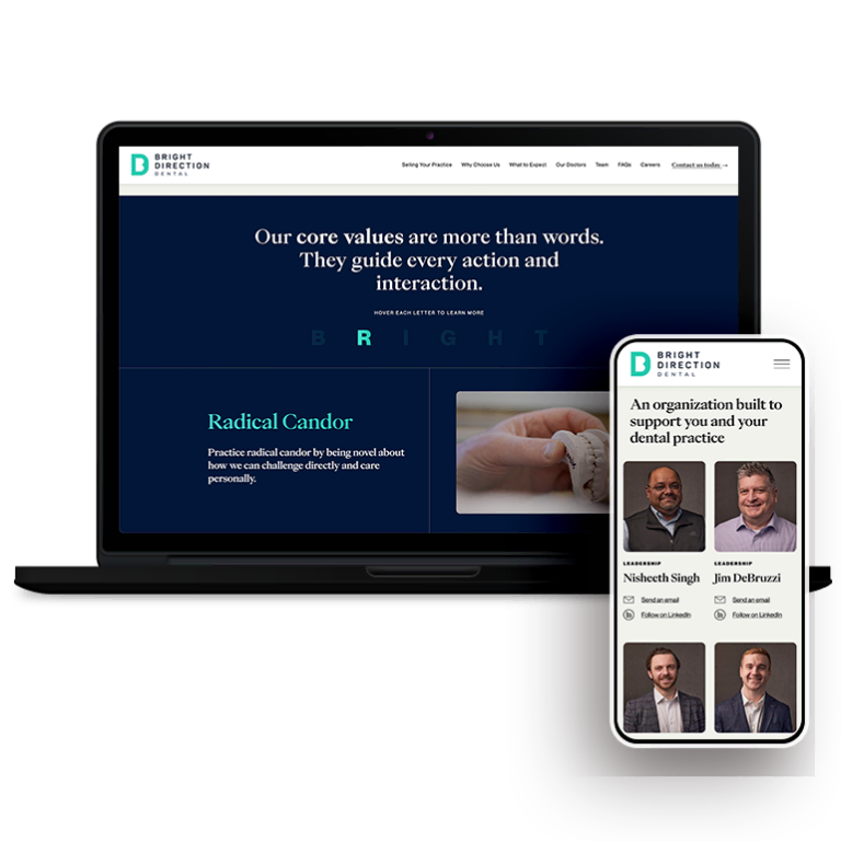
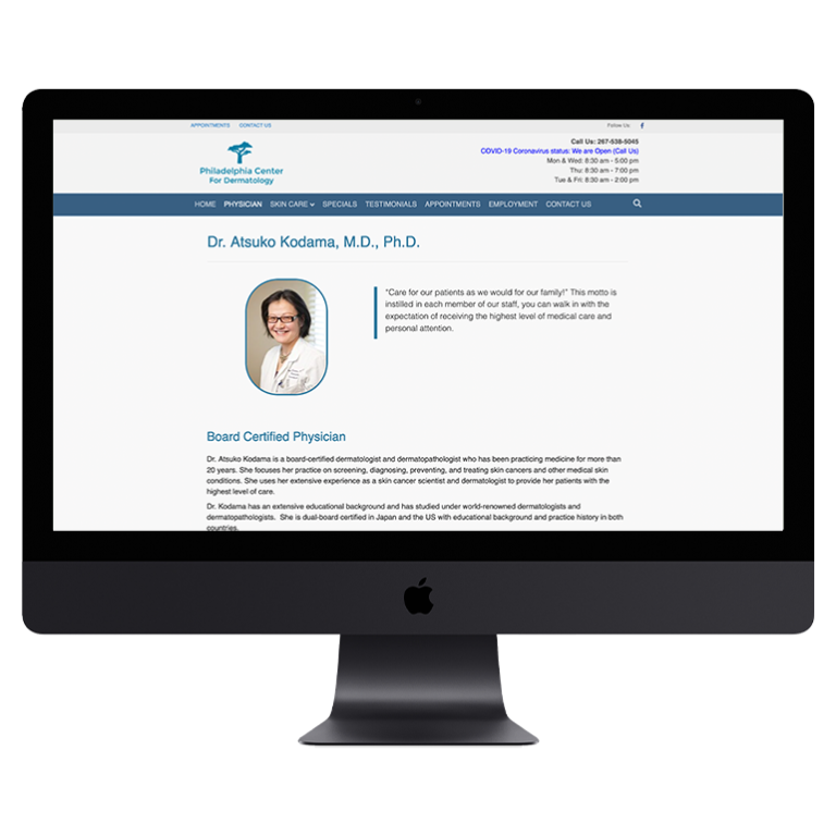
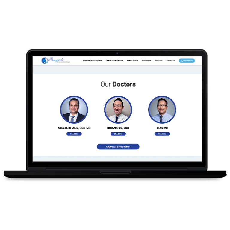
- Interviews with and/or profiles of hospital physicians and specialists
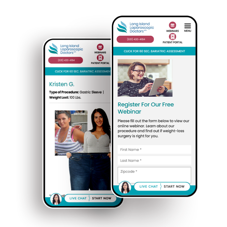
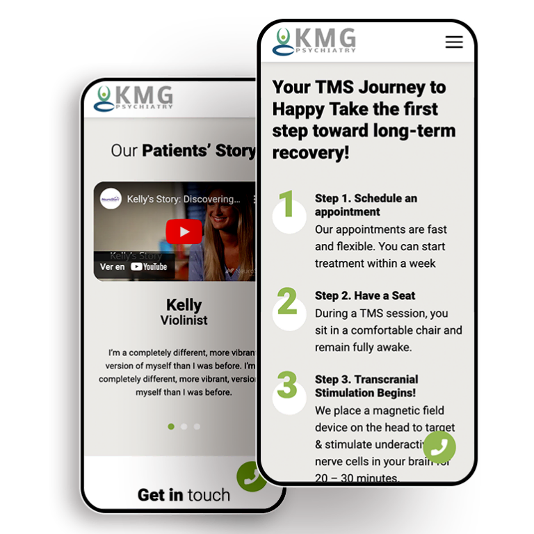
- Patient testimonials
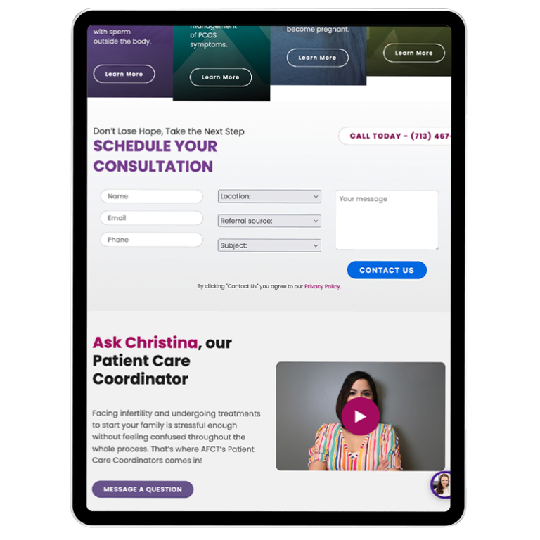
- Easy-to-understand symptom and/or treatment explainer videos
Check out this article for some examples of great hospital video content.
Educate Your Patients — Don’t Confuse Them
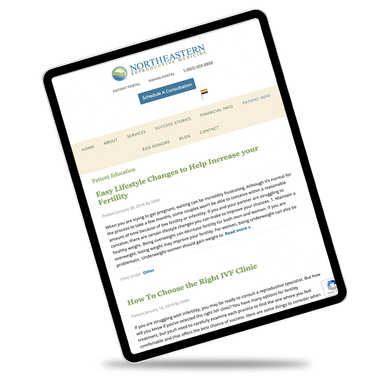
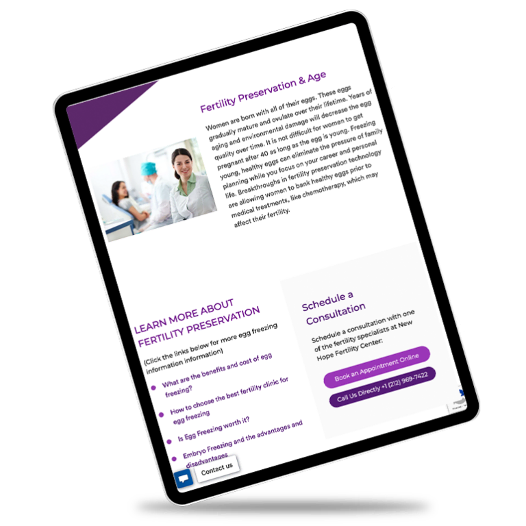
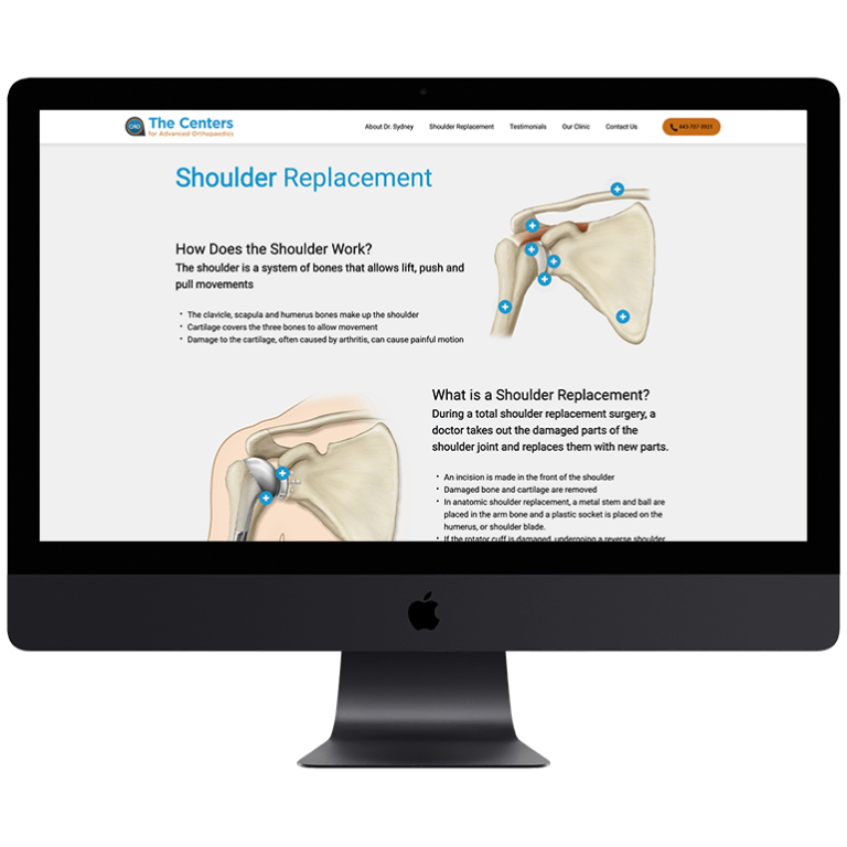
While it might seem like providing highly technical explanations of every condition and procedure might help convey a high-degree of expertise, resist the urge to fill the pages of your site with dense jargon. Chances are that most of your patients don’t have medical degrees, so you need to make sure that all information is being communicated in simple, digestible terms.
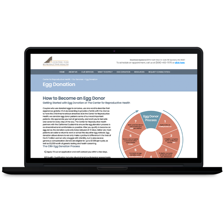
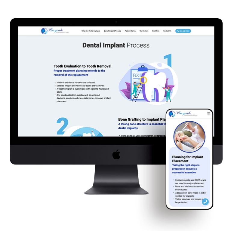
The way in which your content is organized on the page is also important. For example, if you want to provide a more in-depth explanation on a specific surgery or procedure that your hospital specializes in, don’t just tack it onto a general page that’s already loaded up with information. Instead, give that topic its own section — or even its own subdomain — to make it more manageable.
Your Patients Shouldn’t Need a Compass to Navigate Your Site
According to Nielsen Norman Group, visitors typically leave websites after 10 to 20 seconds — that means companies have about 10 seconds to effectively convey their value proposition and convince the user to stay. If your site is laid out in a confusing manner, chances are visitors won’t be able to find the information they’re looking for, and they’ll simply give up and head elsewhere.
Here are a few elements that help reduce confusion and keep visitors from leaving your site out of frustration:
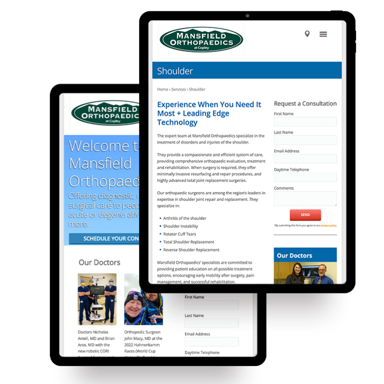
- Clear, understandable headings and bullet points to make the page scannable
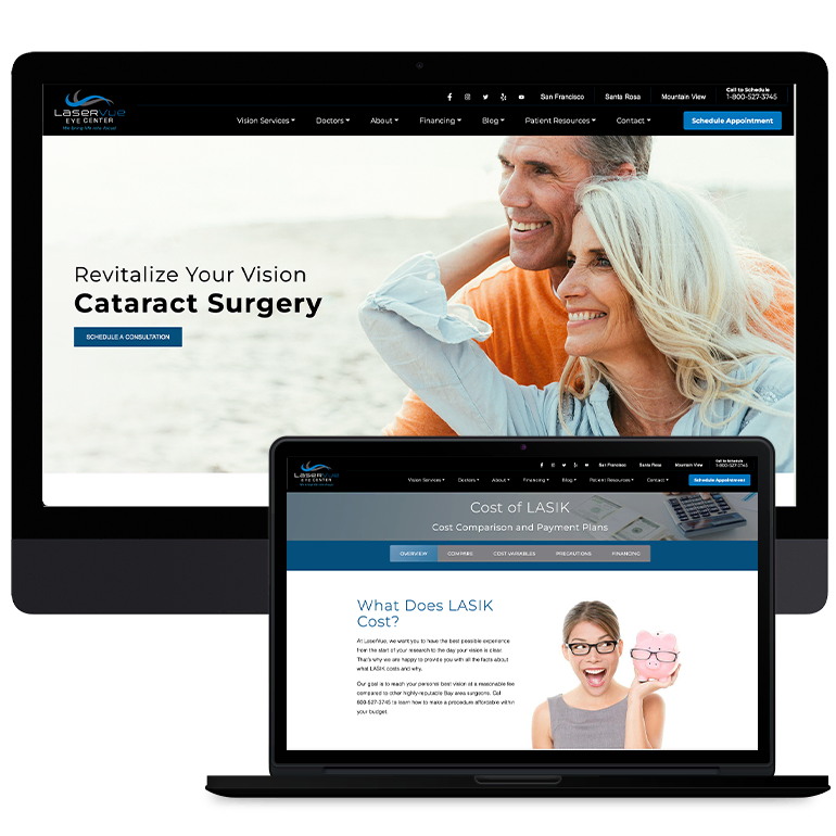
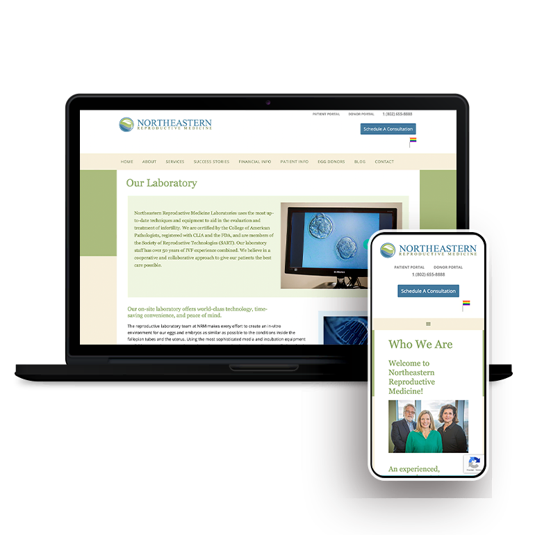
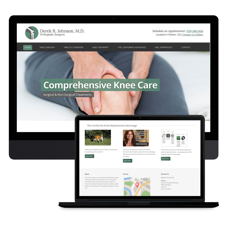
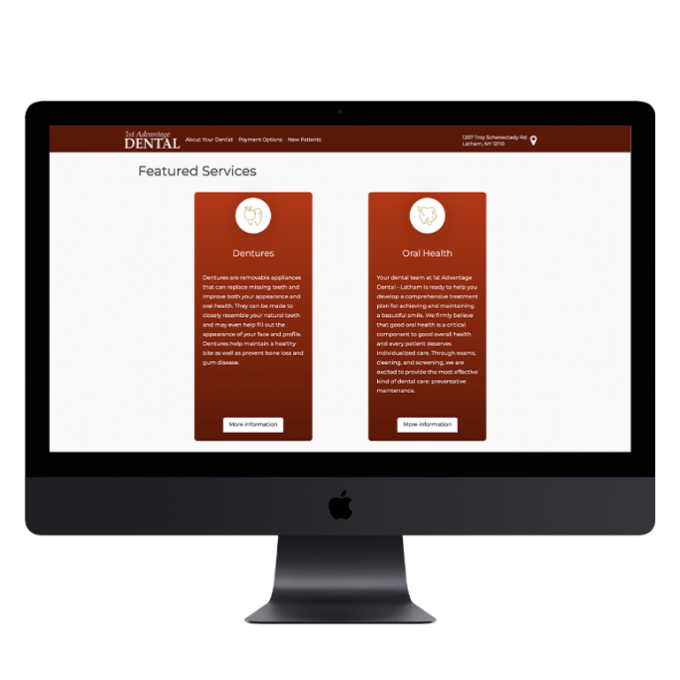
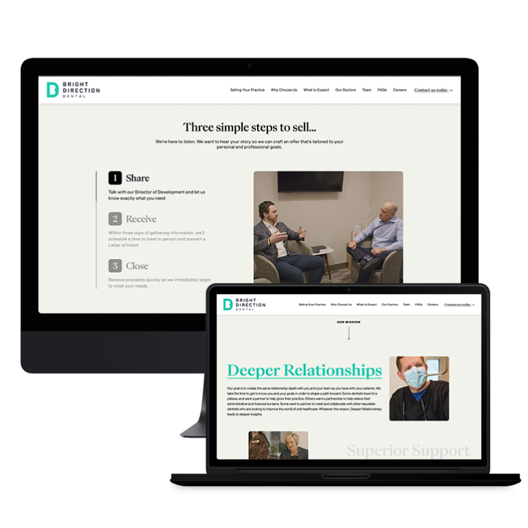
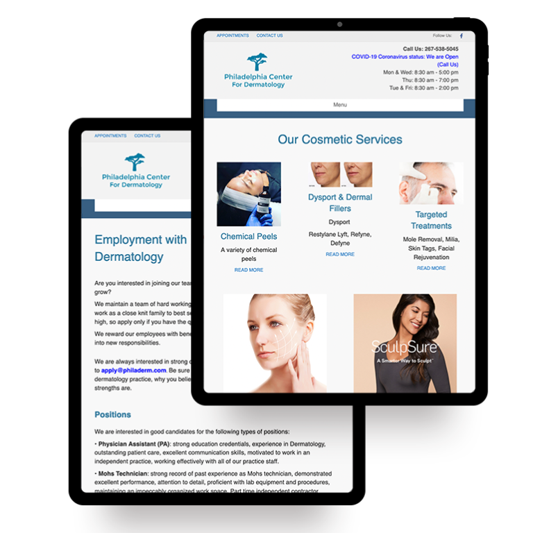
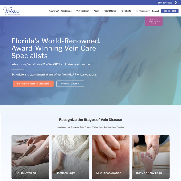
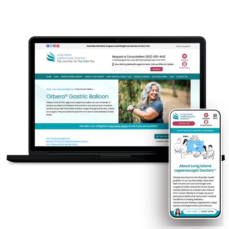
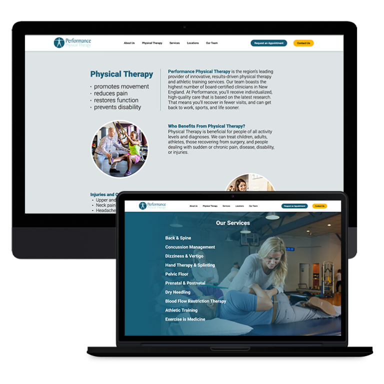
- Intuitive and clearly labeled navigation bar with links for all sections and services
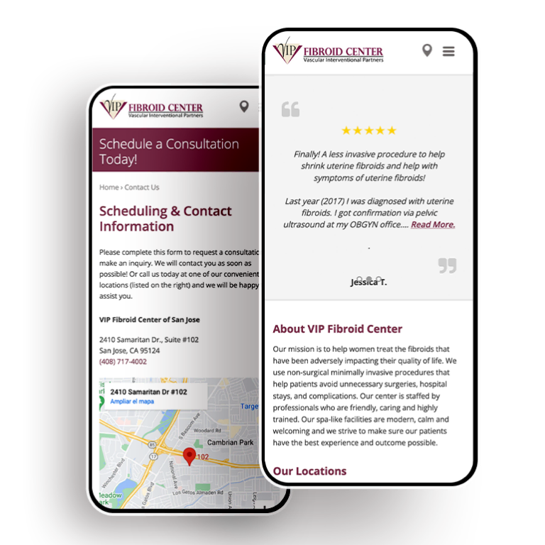
- Basic contact and business listing information in case they need to get in touch with more specific questions
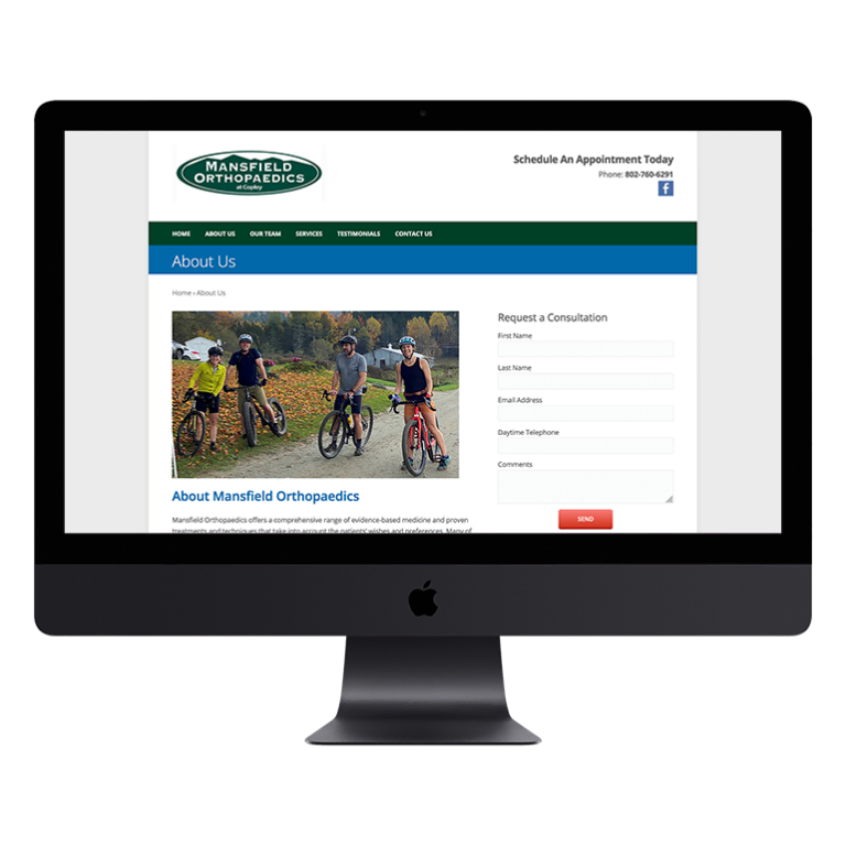
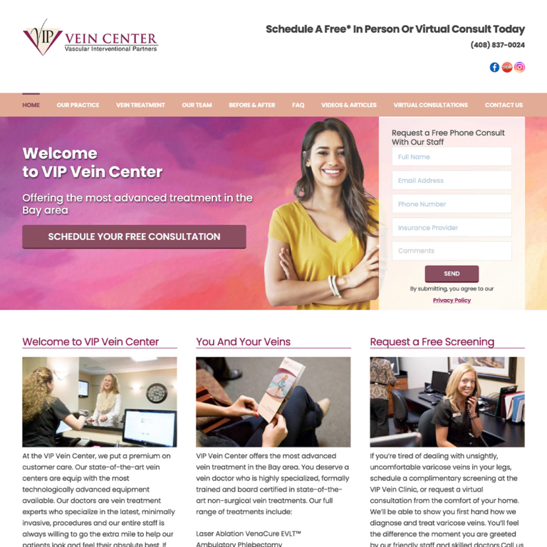
Make it Easy for Visitors to Become Patients
Consider the following scenario: you’ve invested in a digital ad campaign, a patient clicks through to your website, they spend some time familiarizing themselves with your services and staff, and they’re ready to book an appointment — but unfortunately they can’t figure what the next step is, so they abandon the process and end up going with one of your competitors.
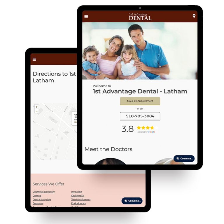
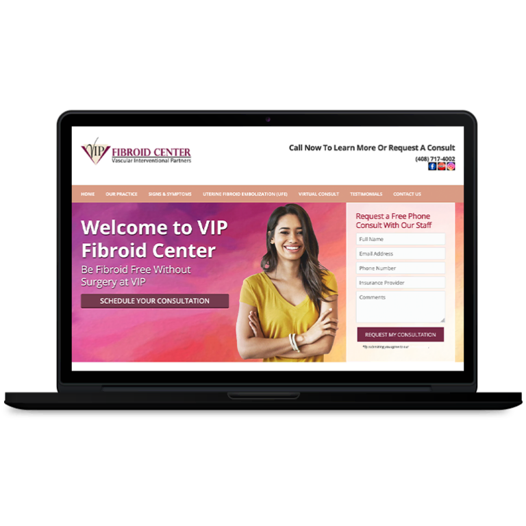
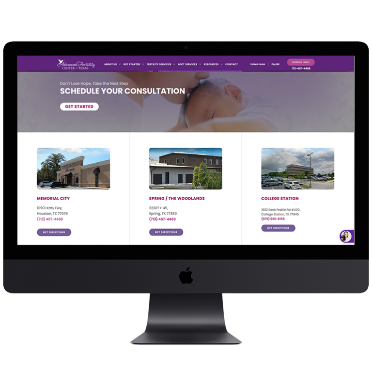
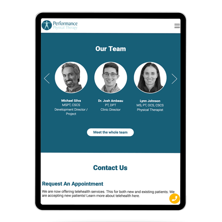
Obviously this is the last thing any hospital marketer wants — but luckily, it’s a relatively easy problem to avoid. Including calls to action (CTAs) across your website ensures that once patients have the information they need to make a decision, it’s easy for them to convert.
CTAs lay out clear and definitive steps that visitors can follow to obtain more information about your hospital, or even become customers right then and there. Some common CTAs found on hospital websites are:
- Call us right now to book an appointment
- Book an appointment online with our e-scheduling tool
- Email our staff with any questions you might have
- Fill out a prospective patient form and our staff will be in touch to help you schedule an appointment
At the end of the day, the internet has emerged as the most cost-effective and impactful tool for hospitals looking to attract new patients. But as the competition online continues to intensify, it’s those who are willing to put in the time and effort to remain in-step with evolving best practices that will ultimately come out on top.







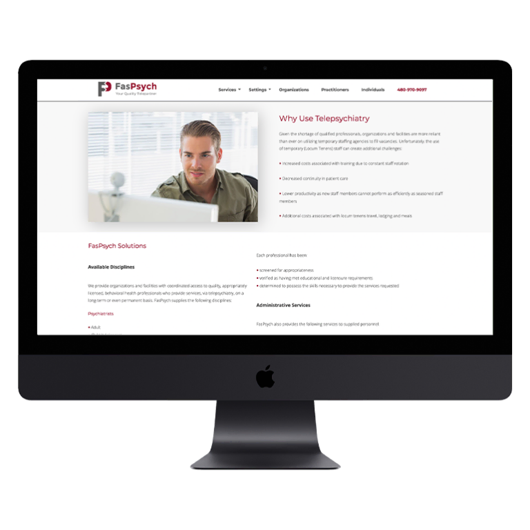
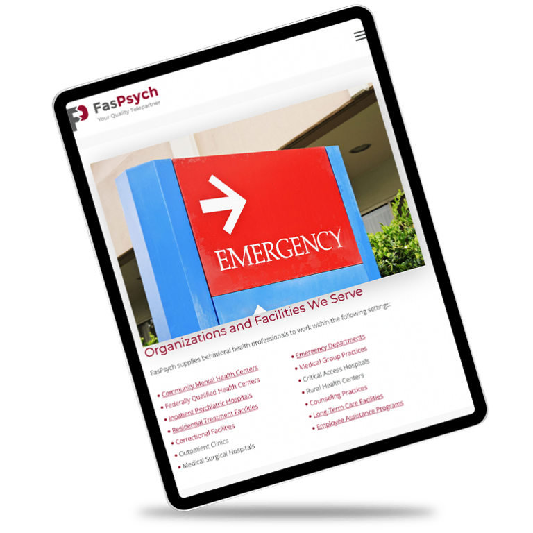
 Smart Design Creates New Patient Opportunities