As smartphone adoption rates continue to rise in 2018, optimizing your healthcare organization’s website for mobile is a non-negotiable requirement.
As we move into 2018, I can’t overstate the importance of a mobile presence for medical marketers, especially now that more than half of all web traffic is coming from mobile devices like smartphones or tablets. Since more than 62% of smartphone users regularly search for information about a medical condition or treatment on their device, practices with websites that are difficult to browse with a mobile device are likely going to lose out on new business.
Of course, Google’s Mobile-Friendly tester is a great starting point, but as the level of competition for mobile users continues to heat up, healthcare organizations need to take their efforts further in order to generate new appointments online. A full mobile SEO website audit is the best way to ensure your site is optimized for both mobile browsing and mobile search. Here are a few key areas to focus on.
Mobile Keyword Strategy
The first step of your mobile audit should be your keyword strategy. Mobile search presents a dilemma for medical marketers since smartphone users tend to either search with short, quippy phrases or — in the case of voice search — longer, fully-formed questions. A quality mobile SEO strategy relies on a balance between shorter, typed searches and longer-form keyword phrases that align with the most common spoken queries.
Another aspect of mobile keywords that medical marketers need to consider is location. When they pose a query on mobile, most users assume that their devices will use geolocation to fill in the context. Medical practices should make sure that they’ve optimized their Google My Business listings and used the appropriate LocalBusiness schema markup on their sites.
Google Search Console
Fortunately, medical marketers don’t have to rely on guesswork or intuition when it comes to keyword research. Google Search Console identifies the phrases that bring prospective patients to your site, as well as opportunities to capitalize on other terms that align with your practice’s services and patient base. Thought Search Console is hardly comprehensive, it’s a valuable resource on the path to mobile optimization.
Search Console also offers a number of useful tools for finding mobile-related errors on your site. For example, select the ‘Smartphone’ tab under ‘Crawl Errors’ to find sticking points, or check the ‘Mobile Usability’ report to discover which pages have usability issues on mobile, as well as the nature of the problem. Run these tests on Search Console any time you update your site to keep your user experience as positive and seamless as possible.
Site Speed
On mobile devices in particular, site speed can make or break your digital ROI. 40% of users will leave a page that takes longer than three seconds to load, meaning that sites should render as quickly as possible without compromising the overall look or user interface.
Fortunately, Google’s handy PageSpeed Insights tool can quickly identify trouble spots for your site and recommend improvements. If you’ve followed PageSpeed’s instructions and still have a slow site, consider installing an Accelerated Mobile Pages (AMP) plugin. This collaboration between Google and Twitter uses stripped-down code to help content-rich pages load faster. Companies that use it have a better chance of appearing in Google’s Knowledge Graph as well.
Design and User Experience
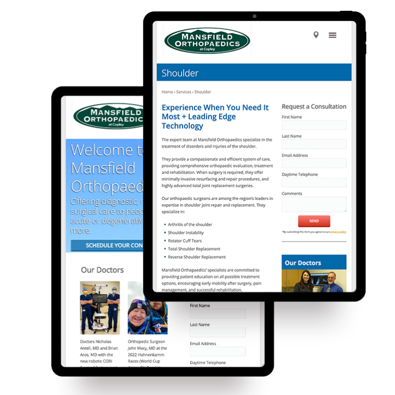
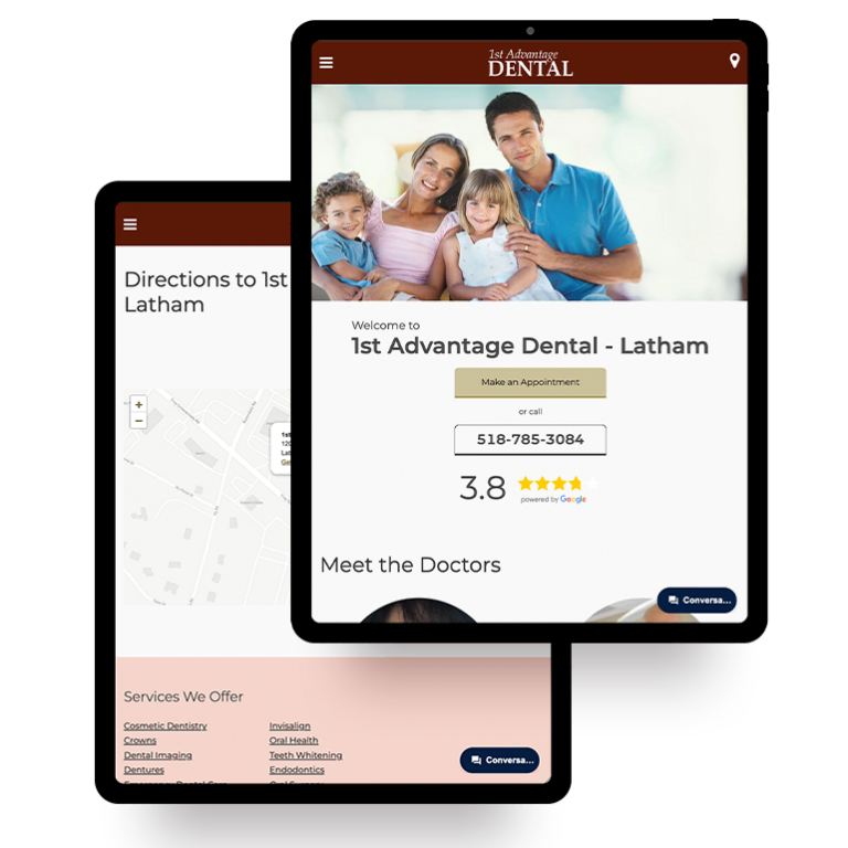
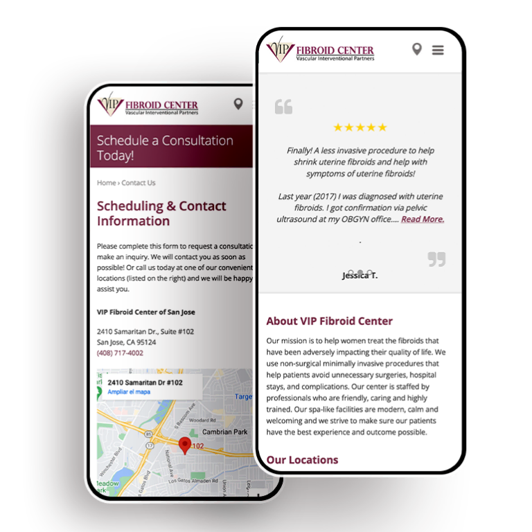
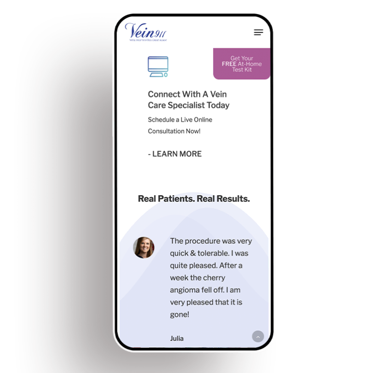
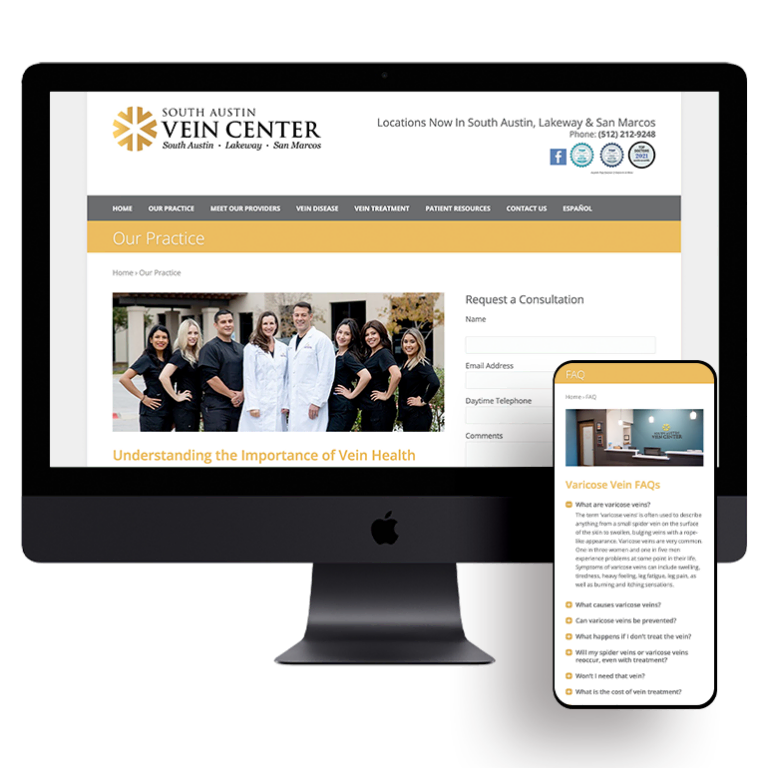
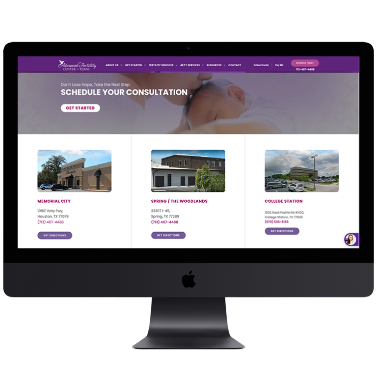
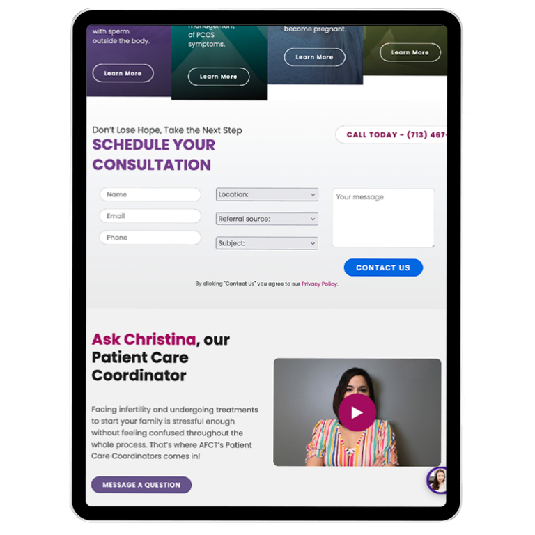
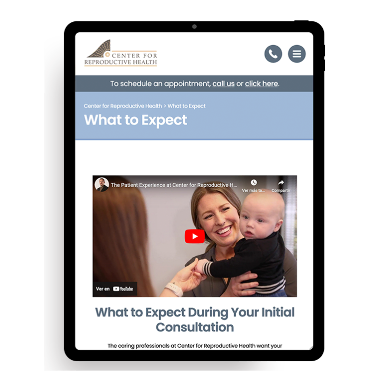
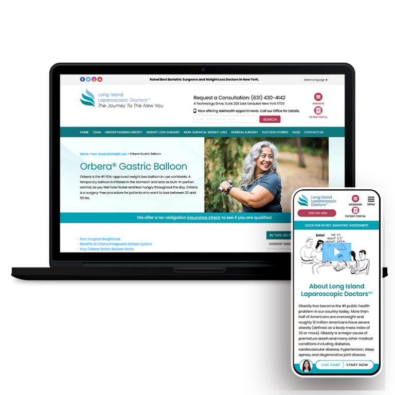
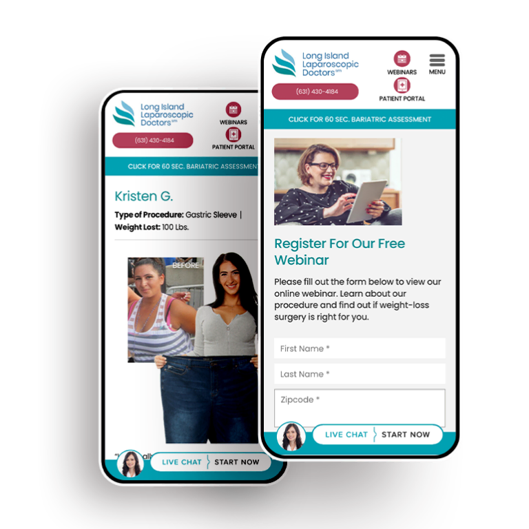
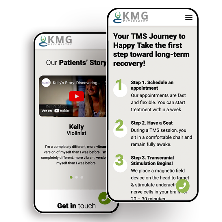
Responsive web design is one of the most important facets of the user experience, but on mobile, it can actually dictate your search rankings. If you’re building a site for your practice from scratch, you might want to consider a mobile-first design.
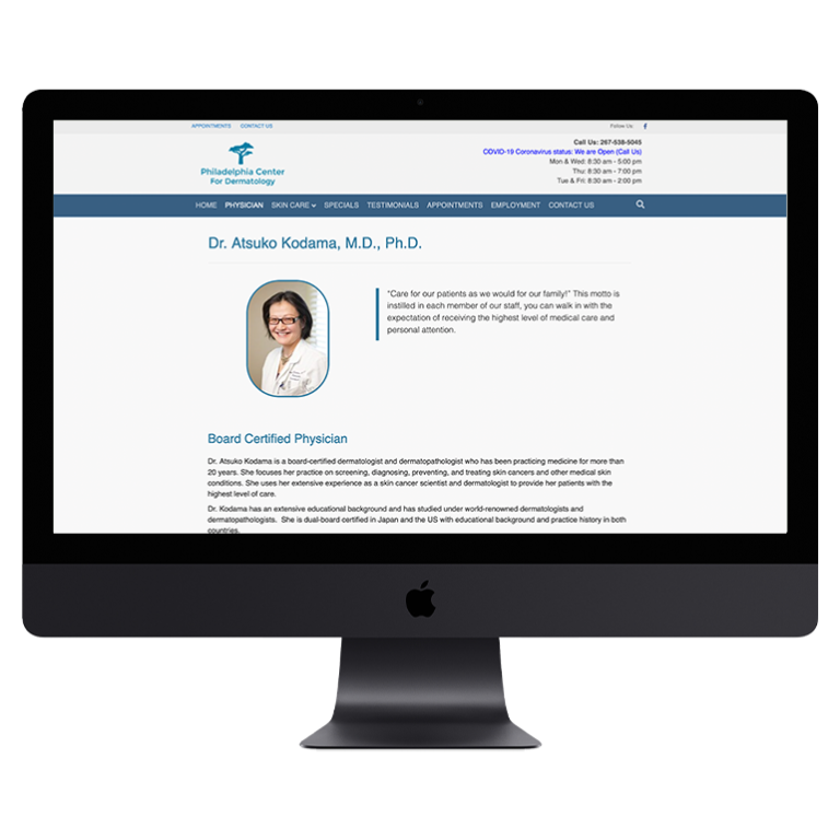
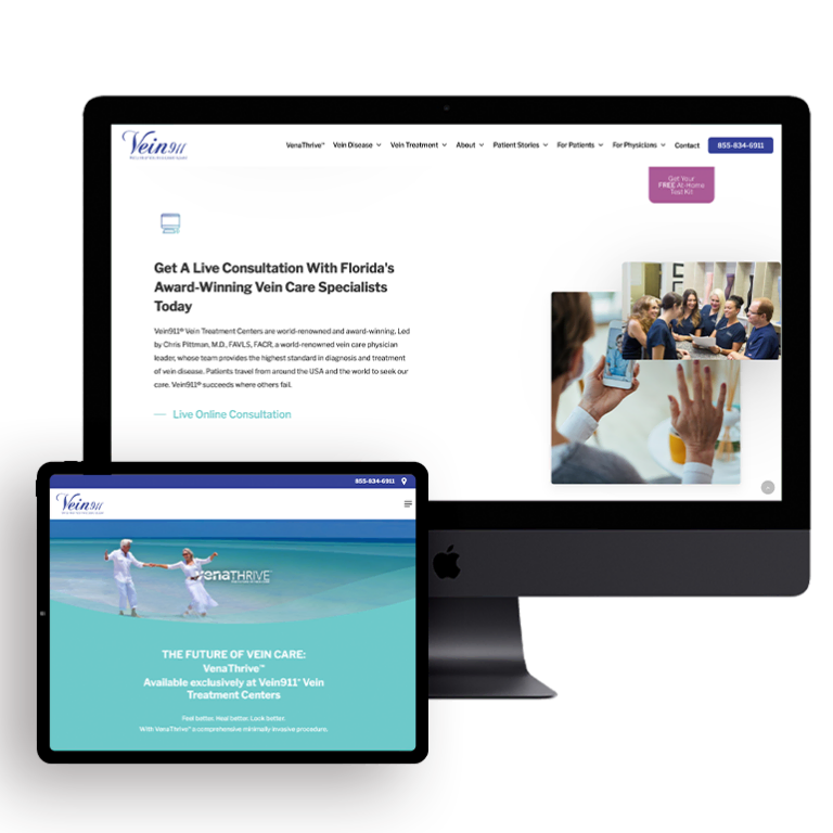
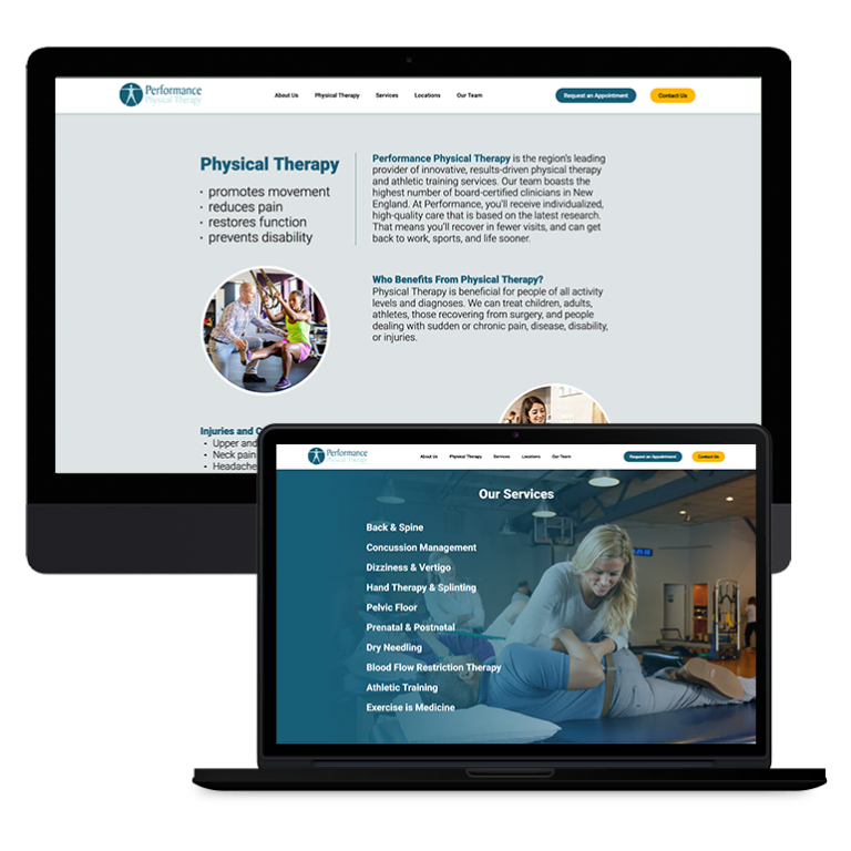
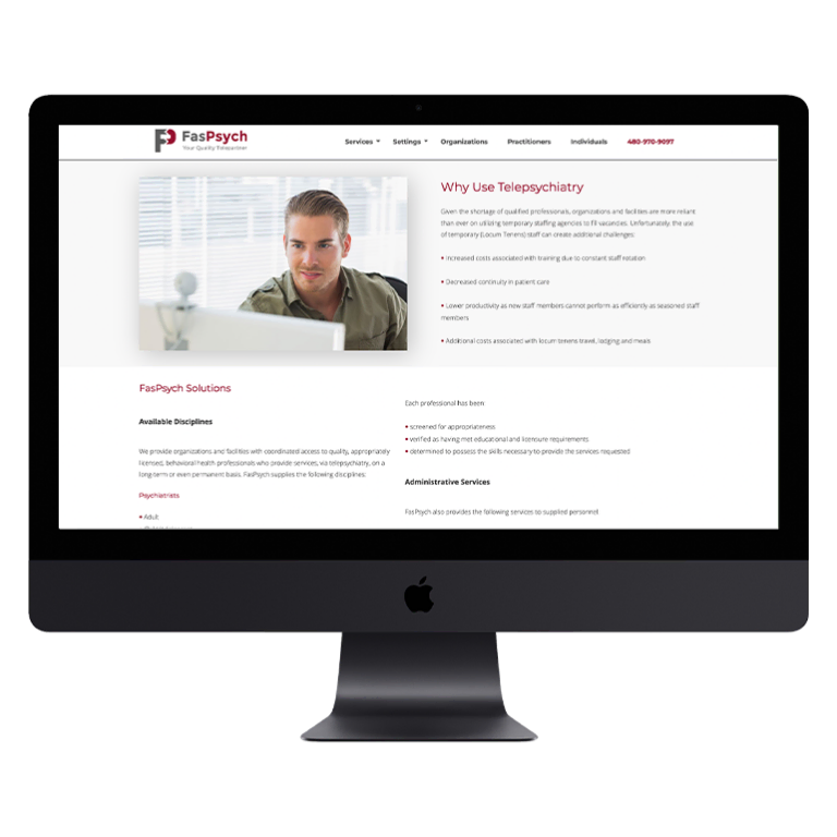
But if you’re simply updating your current site, you can make a couple of tweaks to improve users’ mobile experience. Ensure that your navigation is as smooth and intuitive as possible. Check above-the-fold content for any awkward cut-offs, and avoid pop-up ads or CTAs as much as possible. Remove Flash content from your site, as it can cause loading issues on mobile and make your videos responsive so that the screen adapts to the size of the phone. Lastly, check that your mobile and desktop designs are consistent, and continually test on as many devices as you can.
Written Content
As a medical practice, it’s tempting to put as much information on your site as possible to position yourself as an educational resource for potential and existing patients. But on mobile, that strategy can work against you. Put wordier content into blog posts where it can improve search rankings without interfering with the user experience. Put key information into the first paragraph or two of your site so that mobile users can find what they need quickly and efficiently.
Reporting and Tracking
A mobile SEO audit is not a one-and-done exercise. To make these efforts worthwhile, medical marketers need to measure and track their mobile traffic through a platform like Google Analytics. Regularly revisit your traffic data to help you make decisions about mobile-friendly changes and implementation.
Improving your practice’s mobile presence doesn’t have to be scary or difficult. By implementing these simple techniques, you’ll increase your visibility to potential patients and drive traffic — along with conversions — to your site.





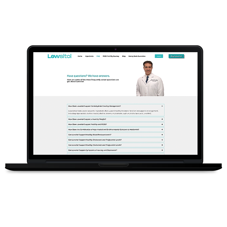
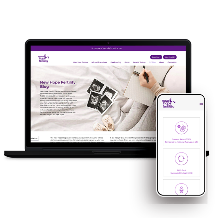
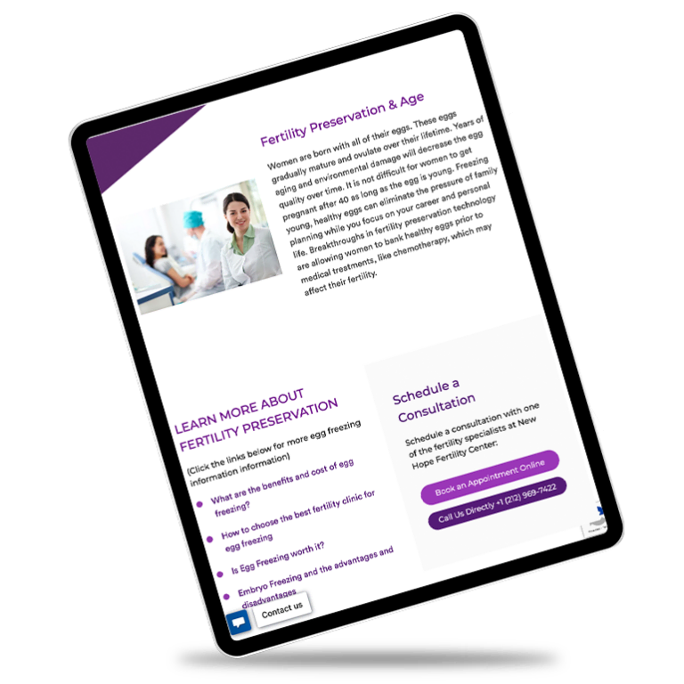

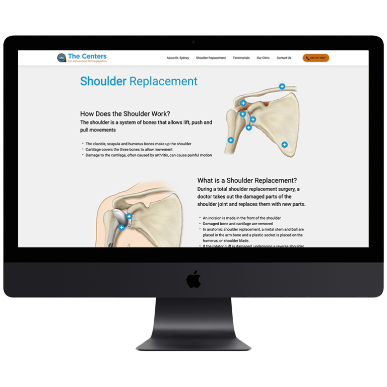
















 Smart Design Creates New Patient Opportunities