An ineffective user experience can decrease conversions and hurt your brand. Here’s how medical marketers can optimize their websites and avoid common UX mistakes.
Promoting your hospital or medical practice with PPC ads and SEO strategies is key to increasing traffic, but potential patients need to actually enjoy using your website if they’re going to convert. Without a positive user experience (UX), patients are likely to abandon your page in favor of something more aesthetically appealing or convenient.
UX is one of the trickiest and most overlooked aspects of digital marketing, but there are simple steps medical marketers can take to improve their websites. Here are some common UX mistakes hospitals and medical practices often make — and how to transform them into user-friendly design.
1. Unresponsive Pages
When a potential patient reaches an unresponsive page, there is nothing holding them back from just leaving. An error message suggests that your website is experiencing technical glitches, which reflects poorly on the quality of services you provide. In rankings of top medical websites, WebMD and Healthline tend to receive the highest monthly traffic — and a large part of this success is due to the fact that consumers find their sites to be accessible and convenient.
A common cause for unresponsive pages is a missing link on a drop-down menu or elsewhere on the site. To troubleshoot this issue, make sure all of your links are connected to an existing page. It’s also important to optimize your site for mobile. Pages should load quickly on both desktop and mobile browsers in order to keep patients engaged.
2. Confusing Navigation
Did you know that the average person’s attention span is just eight seconds? To capture patients’ interest quickly, make sure each page on your site is clean, engaging, and well-organized.
A potential patient will quickly abandon your hard-won click if your website is too difficult to navigate. Make sure the structure of your pages is intuitive, and that each subpage is categorized logically. If your site has too many options on a drop-down menu, or if it offers an untenable number of links, users will become easily overwhelmed and likely exit the page.
3. Slow Load Times
A recent study showed that 47% of internet users expect a page to load in two seconds or less, and that users will almost certainly leave a site if it takes longer than ten seconds to load. Checking your pages’ load times via Google’s PageSpeed Insights tool is a quick and relatively easy process with potentially major benefits for your website’s UX.
Internet users’ lightning-fast attention spans mean that reducing load time — by whatever amount you can — can help to improve UX, and therefore increase conversions. There are several strategies to accomplish this, including reducing image size and compressing files when you can.
4. Forgetting that Patients Come First
It’s important to remember that design isn’t a purely technical endeavor. With all the focus on web page analytics, medical marketers often forget that sites are built for patients to browse and enjoy. SEO can be an effective way to improve search placement, but your SEO strategy can’t stand on its own without a good UX.
Converting patients is impossible if users don’t want to spend time on your website. For the best UX possible, always remember that the patient comes first. This means designing with the user in mind, and creating compelling, informative content that speaks to their needs and concerns.








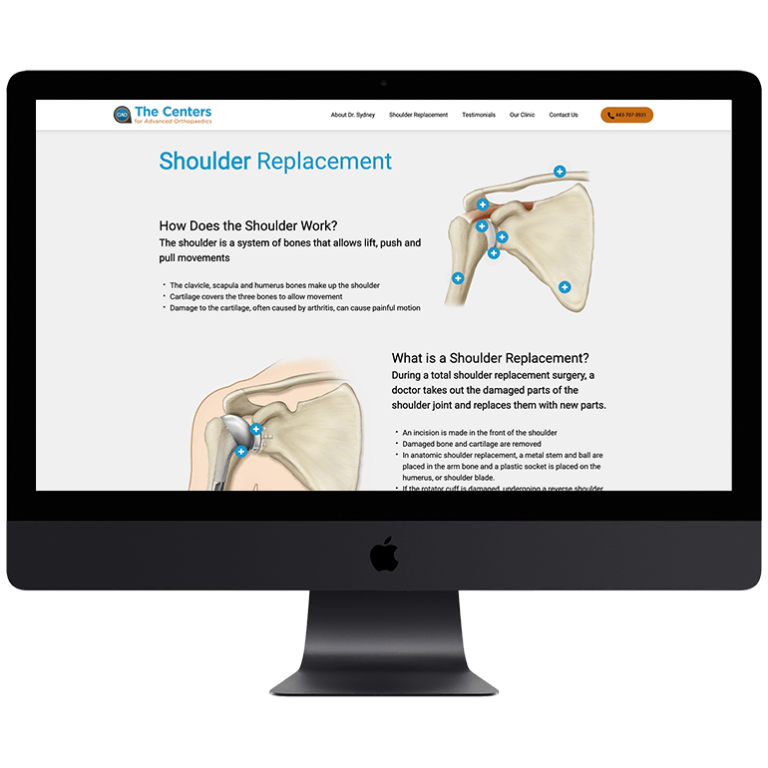


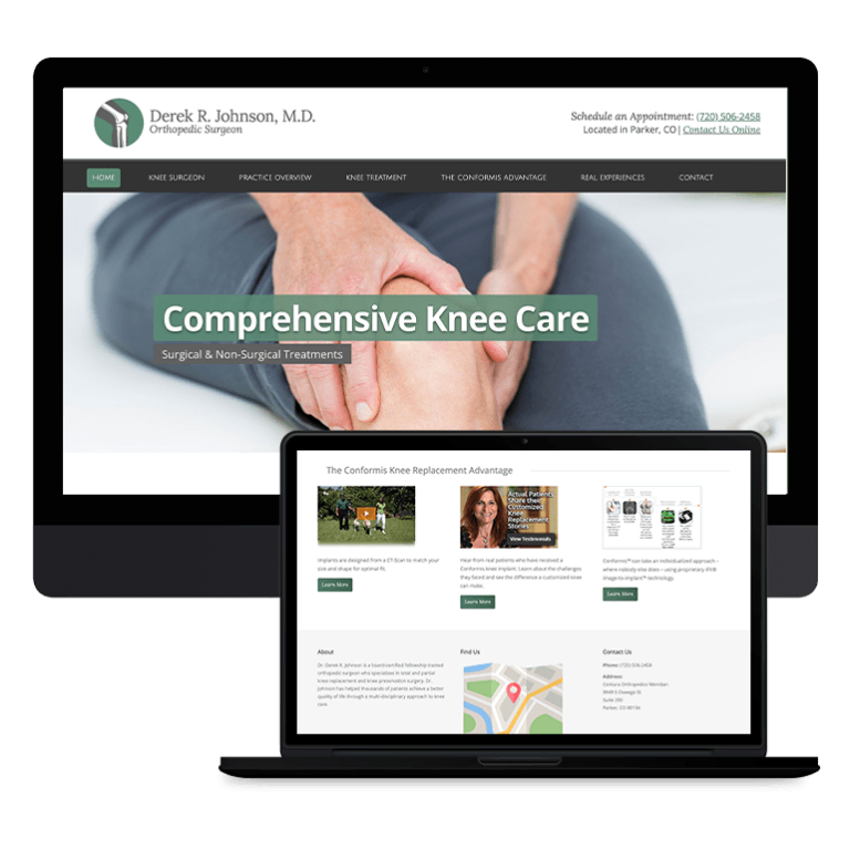

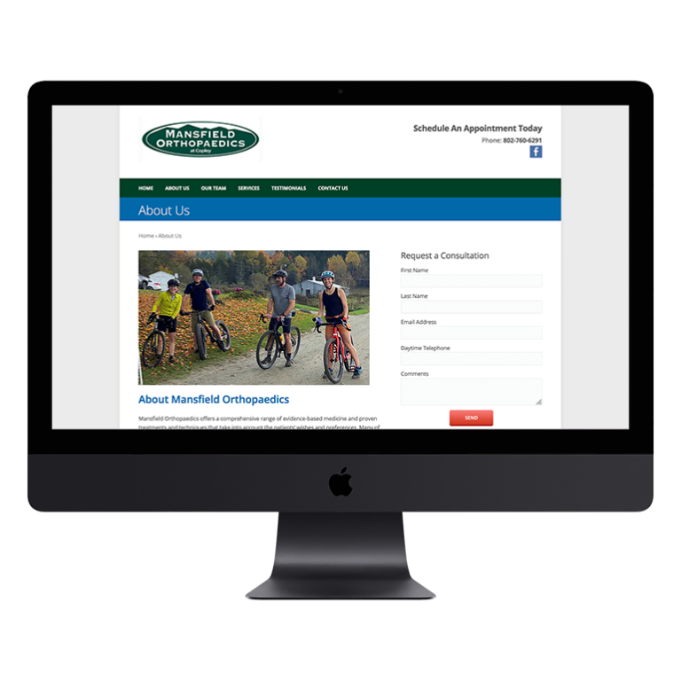
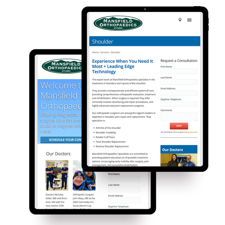






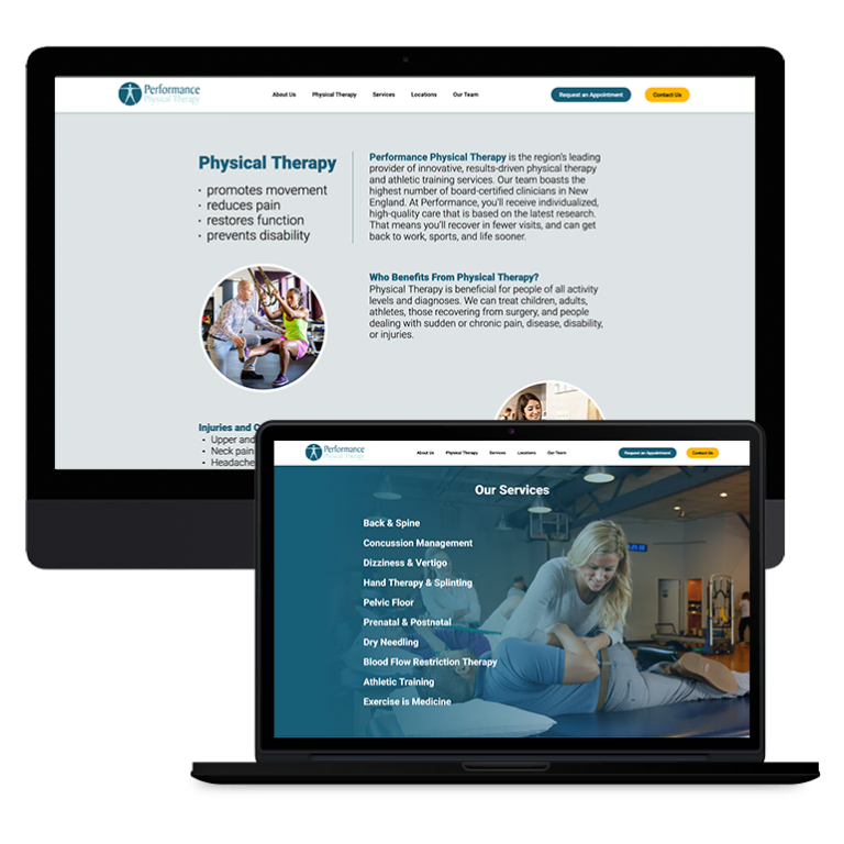



 Smart Design Creates New Patient Opportunities